What is showing up as the default skin right now? It should be this one.
Are you guys getting the default white vBulletin skin as the default when you hit the page?
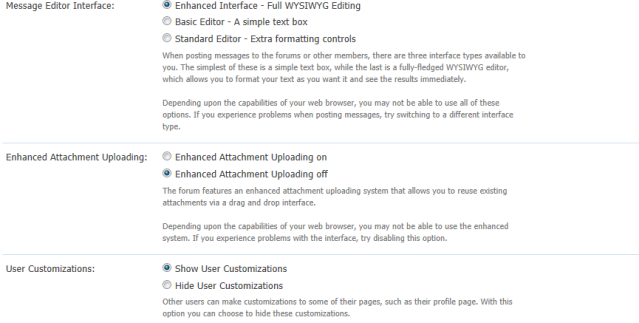
This is all I found under misc. options.
Last edited by a moderator:
What is showing up as the default skin right now? It should be this one.
Are you guys getting the default white vBulletin skin as the default when you hit the page?

Not sure if I like this skin more or less than the previous ones.
I do miss the AGM forum icons though.
Okay, it was a bad idea for me to get new skin. I still can't send post or send messages on IE, nor can I edit any.
I was forced to download Firefox, which bugs a lot on my computer.
I like it.
I'm sure the tweaking of colours here and there to make things readable won't interfere with formatting from now on, so I'm happy you've found your permanent skin! Wowhead tooltips are awesome. Thank you very much for paying so much attention to these details!
The design is very nice, and the mustard yellow isn't so bad. It fits with the hues of the Lucky Fishing Hat.
Apropos LFH;?
The pop-up when adding links, images etc to a post needs a font colour change. (Image)
I have the new skin. I'd just like the old one
Also, just a suggestion or two:
I don't really think there needs to be a headline to show a like dislike button, i think the button is enough. Also if you are going to leave it, changing the text so that it no longer includes dislike might be a good idea.
As for the second thing, I would suggest that instead of bringing you to a menu, it would simply be a button to bring you to the forum under which the topic exists. If it is going to stay as is, then I would suggest adjusting the size so that there is no left/right scroll bar.
Both issues have been addressed.
I took out the header bar for the Like/Dislike in the signature.
As for the Quick Navigation, I just straight up removed it as to get it to style properly would take A LOT of work and custom coding into a vBulletin style that is on the server which would screw up other skins.
Well, probably minor detail but there is a connect with us on Facebook link with no valid Facebook page connected to it
Yah, I get an error on that one too.You are talking about the footer link correct?
")